
Thursday 25 December 2014
White Form (Mixed media on canvas, 25cmx20cm 2014)
Saturday 29 November 2014
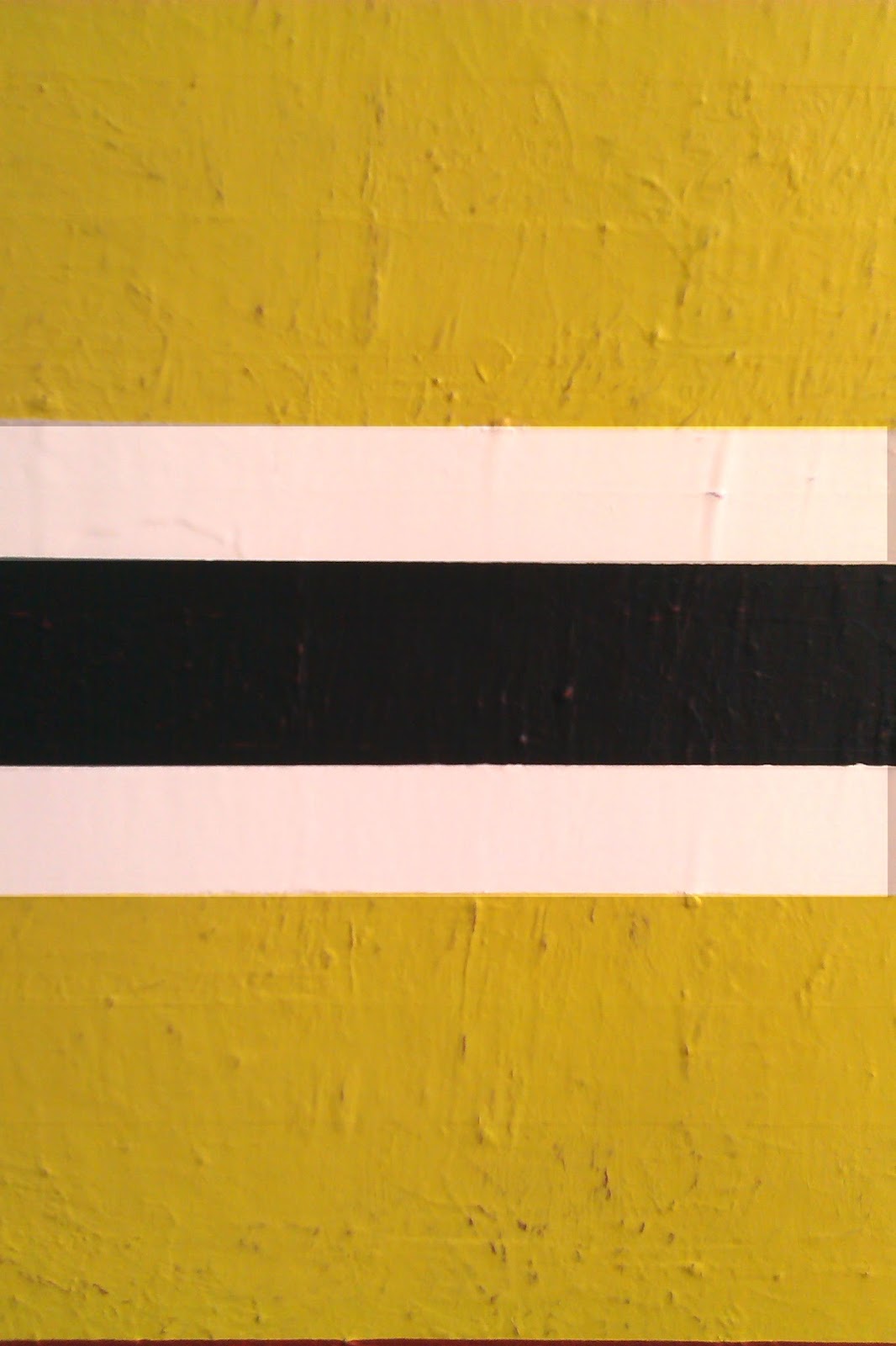
White on Greens, (Acrylic on wood board, 34cmx46cm Sept 2013)

Some things are just not meant to be. Like in the case between me and greens, for instance. Once my favourite colour of all, now my association with it is securely cemented in the past. I happened to create this little piece in between other works and it just stayed there, in my mind and showed me a new direction to take. Hastily thrown together, more because I wanted to work on wood than for any other reason. Wood is durable, flexible and this particular piece held an alluringly reddish glow. Red wants green to stay civil, so I looked for a balancing counter measure, so green it was. Since this piece came about, I have had several opportunities to converse with green, conversations that has uniformly failed. Of all the colours, green is the one with the strongest associational baggage, ie Nature, Grass, Leaves and all that. Thus it's a struggle to overpower this its legacy of reflecting the natural world around us. I nevertheless view this piece fondly as a point of departure. A departure into the future. Beside its colour one other aspect of this work remains important to me, namely the role of distinction and resolution of parts in a work. By rejecting detail and centralized objects a whole new vista of colour and proportionality emerged. Most of my works that followed this unassuming little painting has kept dealing with the very same issues it raised; the presence of specific colours and how proportion gives a narrative to an otherwise inactive surface.
Monday 10 November 2014
Yellow, Black and White Painting (Mixed media on canvas 40cmx40cm) Oct, 2014
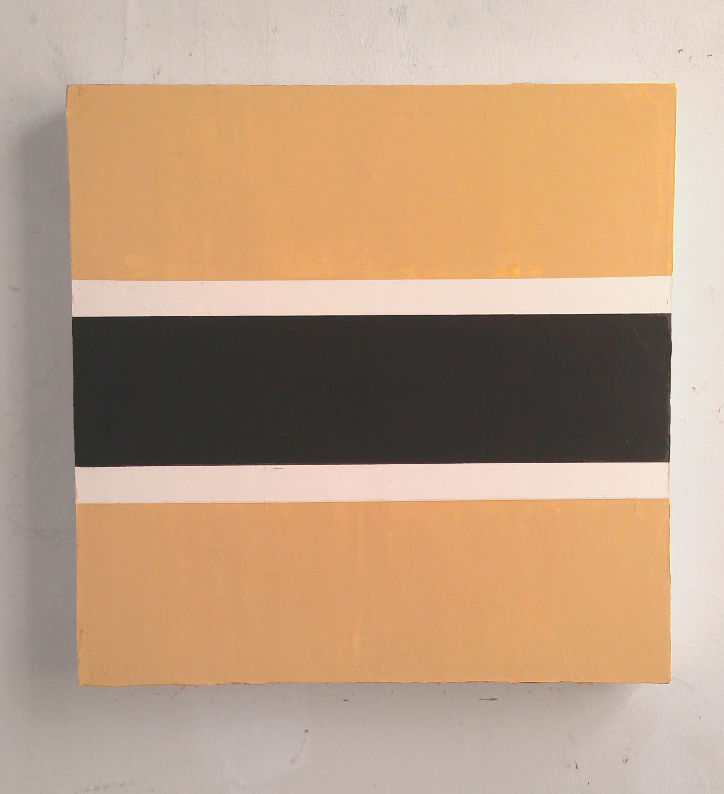
Beside the individual stance a work takes, which I wrote about in an earlier post, the individual motivation driving the artist is of consuming interest to me. I never let the impossibility of verbalizing what essentially is a visual practice stop me from asking myself questions such as;
1. Why did they paint that?
2. What feeling/stance/message/presence did they aim for?
3. What did they want to achieve, generally and specifically?
4. Who did they paint it for?
5. Where did they see their painting in the future?
6. What does the artist feel their work consists of?
7. How much is created for visual effect?
8. How much is formal investigation?
9. If they feel they 'investigate' anything, then what is this 'something'?
10. And if they are of investigative nature, why indeed are they investigating?
11. Why is this person painting at all?
12. Is the artist trying to show something and if this case what and also if so, why?
13. To which of the dizzying array of historical traditions do the artist link their work, and why?
14. Where do they want their painting to lead them?
15. How has previous success or failure informed their painting in the present?
16. Are they available for comment, are they comfortable talking about their work?
17. Are they up for critical discussion on the merit of their work, their chosen process and indeed constructive criticism?
18. What have they included on the surface, what have they omitted and why?
19. What material are they using and why?
20. Is their work planned or improvised?
21. What is 'planning' or 'improvisation' for the artist in question?
22. To how high degree does the individual artist opt for the recurring response pertaining to 'intuition', 'inspiration' or 'feeling'?
23. Do they find themselves in a dark room where they frantically wave canvas, brushes and cloths around them in a continuous attempt to find the light switch?
24. Or do they calmly deposit another piece to neatly fit into a larger mosaic to illuminate their idea on the particular topic of their choice?
25. How much of their work is about Themself/The World/The Material?
26. Or indeed, is it all of the above combined into one, unassailable melting pot of idea/memory/material?
27. To which percentage does each individual artist think their work can be talked about, described or discussed?
28. Does the artist work closely together with other artists or mainly solitarily?
29. Has the artist's practice/style/general outlook gone through significant development?
30. What type of criticism does the artist most often encounter regarding their painting?
As much as I enjoy the visual impression any painting gives me, I feel knowing something about the artist behind it helps me in my appreciation of said work. The artist uses his individual character to inform his work. If I see a work without knowing anything of its creator I will unfailingly fill in the 'blanks' with previously acquired knowledge or simply my own intuition. What I then see and how I interpret this work will be still be informed, just not from anything its creator has offered apart from the work itself, and in my opinion this is a less satisfying state of affairs.
Sunday 5 October 2014
Three, Four (Mixed media on canvas 80cmx100cm) July, 2014

Wednesday 24 September 2014
Around the World Creative Blog Hop Post!
I have been nominated by a fellow artist, Francisco Alonzo (www.raeburnsramblings.blogspot.com) to take part in this project, called "Around the World Creative Blog Hop", no less.
The rules are the same for all participants;
Answer the four questions, publish the answers via your blog and then nominate three new artists to continue the merry dance.
So here goes, my contribution to this arty adventure:
Martin Olsson's
Around the World Creative Blog Hop
The rules are the same for all participants;
Answer the four questions, publish the answers via your blog and then nominate three new artists to continue the merry dance.
So here goes, my contribution to this arty adventure:
Martin Olsson's
Around the World Creative Blog Hop
1. What am I working on?
I always have a number of paintings on the go at any one time. As my studio visits are irregular at best at the moment, it makes sense to me to have a choice of projects to return to. I never know which mood the studio will find me in.
I'm investigating colour, space and proportions in my work. Colour I find especially interesting, as a carrier of its own meaning, sufficient to produce a presence that stands up well to investigation and contemplation.
For me, the strict limitation of expressive content is key in honing each work until just the right "note" is reached.
 Detail
2. How does my work differ from others of its genre?
I would have to say by my chosen limitations. The specific limitations I have chosen to work with and how this affects my possibilities to paint is probably the most significant aspect in differentiating my work from other artists' work.
I can enjoy what other artists' create, whether they work in an abstract or figurative idiom. I inform my own work from observing what others have done, whether it's friends or characters from the art historical past. I think that the aim of each artist is crucial in differentiating between individual approaches. What is the artist aiming for? The more I look at others' work, the more this question matters.
 Detail
3. Why do I create what I do?
I can enjoy what other artists' create, whether they work in an abstract or figurative idiom. I inform my own work from observing what others have done, whether it's friends or characters from the art historical past. I think that the aim of each artist is crucial in differentiating between individual approaches. What is the artist aiming for? The more I look at others' work, the more this question matters.
3. Why do I create what I do?
Sitting down, facing the canvas in total solitude whilst listening to music in the headphones is an intensely pleasurable experience. I would happily paint for this reason alone! As it happens, other aspects come into the mix as well.
There is an excitement in experimenting with the picture plane, the deceptive simplicity of using but a few "ingredients" and see how much can still be done. Colour resonates with us on many levels and I find the more interesting levels are those which have less to do with 'beauty' or 'the sublime' and more with straightforward formal inquiry. Simplicity rocks.
 Detail
There is an excitement in experimenting with the picture plane, the deceptive simplicity of using but a few "ingredients" and see how much can still be done. Colour resonates with us on many levels and I find the more interesting levels are those which have less to do with 'beauty' or 'the sublime' and more with straightforward formal inquiry. Simplicity rocks.
4. How does my creative process work?
It's very simple. Technically I use acrylics, industrial or household paint, masking tape and a palette knife.
The starting point is always an urge to make two colours relate to each other on the picture plane. I instigate a conversation, set the tension, a theme will grow from these simple beginnings and I just add and take away as the image develops, almost by itself.
I choose a canvas or a board, I rarely have specific preferences at this stage, a lot is just allowed to happen. Rather than create the image I 'direct' it. Parts will play the roles they innately hold, I simply adjust, tweak and ask them to work together, with each other as well as myself.
 Detail
Well, that was my answers in this Hop, and I'm now very happy to hand over to these three fine people and cracking artists:
Patricia Volk www.patriciavolk.co.uk
David Smith www.davidsmithartist.net
Tim Smith www.timsmith.artweb.com
I choose a canvas or a board, I rarely have specific preferences at this stage, a lot is just allowed to happen. Rather than create the image I 'direct' it. Parts will play the roles they innately hold, I simply adjust, tweak and ask them to work together, with each other as well as myself.
Well, that was my answers in this Hop, and I'm now very happy to hand over to these three fine people and cracking artists:
Patricia Volk www.patriciavolk.co.uk
David Smith www.davidsmithartist.net
Tim Smith www.timsmith.artweb.com
Wednesday 17 September 2014
Belonging (2014) Mixed media on canvas, 122cm x 61.5cm

Tuesday 9 September 2014
Symmetry, balance and nothing. (Safety, 2014 Mixed media on canvas, 61cm x 92cm)

Tuesday 19 August 2014
To just be. (Gutsy Pink, 2014 Mixed media on canvas, 50cm x 50cm)

Tuesday 1 July 2014
Blue on Blue 2014 Acrylics on Canvas 60cm x 80cm

Friday 20 June 2014
Linkage III 2014 Mixed media on canvas 50cm x 50cm

Saturday 14 June 2014
Linkage II, 2014 Mixed Media on Canvas 40cm x 40cm

Tuesday 10 June 2014
Linkage, Mixed Media on Canvas, 2014 50cm x 50cm

Sunday 11 May 2014
Magma One. Mixed Media on Canvas, April 2014 90cm x 60cm

Friday 4 April 2014
Interview with the artist, courtesy of www.thepalettepages.com
Thanks to the great people on www.thepalettepages.com, an online directory promoting art from across the globe engaging artists and art-lovers alike in discussing, networking and sharing ideas about art, I was given the chance to elaborate on my ideas on painting and painters from the past I admire.
Read the full interview here:
http://www.thepalettepages.com/2014/04/03/martin-olsson-interview/
Read the full interview here:
http://www.thepalettepages.com/2014/04/03/martin-olsson-interview/
Friday 28 March 2014
Quiet. State, March 2014 Mixed Media on Canvas 80cm x 100cm

The absence of immediate force has many different results. The freedom this leaves to the beholder has both positive and negative implications. We want to be seduced, but not bullied. We want to be in control, but not have to do everything ourselves, as fellow humans and viewers of art, even. I wanted to stay awhile in the middle ground of action, and experience the special note of potential this offered. A polite declination to join the circus, or indeed the brawl on the picture plane. A tight-lipped stance on canvas.
Sunday 16 March 2014
Time, resistance and strength. Orange and Grey Band, March 2014 Mixed media on board, 73cm x 104cm

Sunday 9 March 2014
A red Behemoth. Sections, Sept 2013, Acrylics on canvas 76.5cm x 122cm

Friday 28 February 2014
Random Harvest. How decisions can be taken. Dutch painting, 2014, Acrylics on canvas, 75cm x 100cm

Wednesday 19 February 2014
Horizontals, verticals and decisions. Yellow, white and black lines, Feb 2014 Acrylics on canvas, 50cm x 75cm

Directions matters in an image, they guide the eyes and give a rhythm to our associations. Most of my work assumes a horizontal narrative. Verticals I find entirely different in nature, less forgiving but also more powerful. The energy given out by verticals is higher, the image gains urgency but there is little peace to be had. Horizontals are still, calm but has less to do with life. Perhaps this is why I prefer horizontals. It is a peculiar fact in my mind that were I to paint but two straight lines across the canvas, regardless of uneven positioning, they'll always work horizontally. Vertically the same two stripes would seriously corrupt the composition were they unevenly placed. Activity versus passivity, doing versus being and many similar analogies. I engineered a meeting between the two aspects in this work, and as you can see negotiations are in full swing. Unusually I used a brush here, a tool I rarely find employable.
Friday 7 February 2014
Edges and continuum. Yellow, red and white band, Feb 2014. Mixed media on canvas, 80cm x 100cm

The edges of the canvas can be approached in different ways. They can be the fence within which the motif lives, or finds itself arranged. Alternatively they can be the signallers that indicate to the viewer that what we see on the canvas may stretch out in infinity beyond where the canvas meets the wall. In the latter case the edges point outwards, into what we cannot see, whereas in the former case the edges invite us to partake in the feast that has been served up in the central area of the painting. I find myself using the latter approach in most cases. Here the areas propel themselves sideways into space at the same time as they stand perfectly still. All enquiries to www.stoopsgallery.co.uk
Thursday 6 February 2014
Proportions in space. Abstract composition, Feb 2014. Acrylic on canvas, 50cm x 50cm

The intensity of content is varied by many different components. Colour, shape and the proportions between them are fundamental building blocks to be sure. Beyond these we have an infinite array of other parts, and considering these, it's a challenge to stay even close to some kind of coherence in a painting. I worked carefully with areas, and placement here, and returned to the canvas numerous times. Initially texture had played a bigger role, but as the colours grew in significance the textural element diminished. I seeked the advice from fellow artists on a few occasions and this was always very helpful. The palette knife was again crucial for determining the nature of the outcome of this work. All enquiries to www.ptfineart.co.uk
Monday 27 January 2014
The humming. Yellow, Red and Grey painting Jan 2014 Mixed media on canvas, 80 cm x 100 cm

Saturday 25 January 2014
Neutrality and Narrative. White and Buff White Painting, Jan 2014 Acrylics on canvas 46 cm x 61 cm

Tuesday 14 January 2014
The cutting of space. Blue and White Composition, Jan 2014. Acrylics on canvas, 40.5cm x 50.7cm

Opposition, Harmony and the Void. Abstract Painting, Jan 2014 Acrylics on canvas, 50cm x 50cm
+copy.jpg)
We pursue everything surrounded by the void. We might oppose something, or somebody. We might be involved in struggle. We might chase a goal. We might have a balanced and fruitful relationship with something or someone, and this always exists in relation to the void, whatever the void might mean. The void can equally mean time itself. Both the past and the future can be seen as a void. Life, death, activity, passivity, individuality and community with others is all played out in the present, in the midst of the void. The void itself, like the blank canvas, creates the singularly most important condition for anything. As I have an interest in science, I wanted the painting to be a homage to earthly, non-lyrical considerations, such as the periodic table or perhaps diagrams of molecular compositions as well as all of the above. A little about a lot.
Subscribe to:
Posts (Atom)